LogoOO
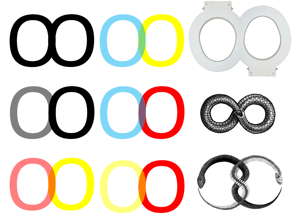
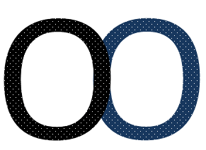
I really like the idea which someone told yesterday of the Logo being just two Os partly merged to form an infinity Sign. So I tried how it would look like and then I was lost. You can see my process in the picture. From just the Same Color nobody knows that is more then infinity (pun accidental but now fully intended.) So they have to be different Color OK, what if they mix their color in the middle. What if OO becomes 00 since we had this discussion with marking the Toilets yesterday also. An this was even before I ever consciously thought about the ACME Company on the other side of the Bay.
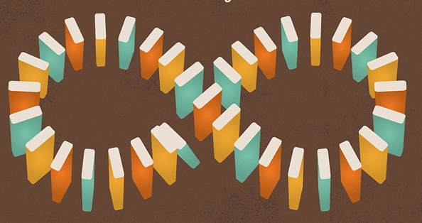
What if you could mark everything with an appropriately adapted Logo? Right middle could be over the Main Entrance. Right bottom could be CCL, Pic2 Book/Café or BAPS. Two jacuzzi, two stoves, a Maskerate mask, Dancing people. I just realize that this is the Wikimedian in me, because there was recently a discussion about logos and icons etc. Anyway I believe there is endless possibilities (Pun intended) for making this a Collective Identity, and strong Brand. Did you also notice that besides ACME two other Big players have the double O in their name. Honestly just noticed that four of the founding members are also Double 0 Agents with the License to Hack, the license to feed, the license to serve and the License to read. Anyway before I get punished for writing Endless Wikipages I leave you with this Mocups until Wednesday and Thursday.
P.S.: There are some things which are larger then a Galaxy two Galaxies which are merging for instance.


